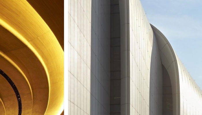
成都標識設(shè)計的綜合體以簡約為主的設(shè)計風格
【人和時代·國際】CRT標識設(shè)計公司,成都標識設(shè)計的綜合體,以簡約為主的設(shè)計風格去做設(shè)計的話,并不是說一定不行,而是要看看具體到綜合體的整體基調(diào)的問題上,是不是適合的。如果綜合體本身的風格,就是想要以簡約時尚,且還是個性的設(shè)計,那走簡約的路線,相對來說還是比較合適的,不會有太大的不協(xié)調(diào)。
成都標識設(shè)計公司在做項目案例分析的時候,首先想到的就是綜合體的檔次一定是比較高的。那在設(shè)計上,也自然是以華麗華貴為主的,但真實的情況還真不是這樣的。綜合體的設(shè)計,其實星級的原因,是可以說占據(jù)了比較重要的一個原因,還有就是一個顏色的選擇,在是不是要考慮到以簡約為主的路線去做設(shè)計的話,可以說色彩就是最好的判斷。選用類似色系,還是單一,這對之后的設(shè)計達不達的到簡約的要求,是比較關(guān)鍵的選擇我們設(shè)計的成都標識項目,比如:成都泰合集團公司項目,重慶鴻恩君御花園酒店項目等,就比較大氣和有檔次。

If the Chengdu logo design complex is designed with a simple design style, it does not mean that it will not work, but to see if it is suitable for the overall tone of the complex. If the style of the complex itself is to be simple and fashionable, and it is still a personalized design, it is relatively appropriate to take the simple route, and there will not be too much inconsistency.
When Chengdu Logo Design Company was doing project case analysis, the first thing it thought of was that the grade of the complex must be relatively high. In terms of design, it is naturally based on gorgeous and luxurious, but the real situation is really not like this. The design of the complex, in fact, is the reason for the star rating, which can be said to occupy a more important reason, and there is also the choice of color. If it is necessary to consider the simple route to design, you can say color It is the best judgment. The choice of similar color system, or single, is the key choice for the design of the future that does not meet the requirements of simplicity. It is the more critical choice for the Chengdu logo project we designed, such as: Chengdu Taihe Group Company Project, Chongqing Hongen Junyu Garden Hotel Projects, etc., are more atmospheric and high-grade.

人和時代設(shè)計
品牌設(shè)計、VI設(shè)計、標識設(shè)計公司


